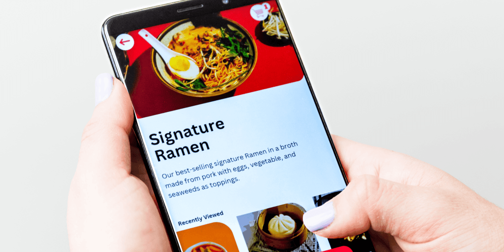
Mobile apps are becoming more than just tools—they are becoming part of how people work, shop, learn, communicate, and manage their daily lives. In 2026, a successful mobile app is not only expected to look good. It should feel simple, fast, personal, and effortless to use.
The best app designs focus on one important question: How can we make the user's experience easier?
From smarter personalization to cleaner interfaces, mobile app design is moving toward experiences that feel natural rather than complicated.
Here are some of the top mobile app design ideas to consider in 2026.
1. Keep the Interface Simple and Clear
Users should not have to think too much about how an app works.
A clean interface with clear navigation, readable text, consistent buttons, and enough spacing can make an app much easier to use.
Instead of filling every screen with information, modern app design focuses on showing users what they need at the right moment.
Simple doesn't mean boring. It means making the important things easier to find.
2. Design for One-Handed Mobile Use
People often use their phones with one hand while walking, commuting, or multitasking.
That makes accessibility and screen positioning more important in 2026.
Important actions such as navigation, search, menus, and primary buttons should be easy to reach with a thumb. Bottom navigation and strategically positioned actions can make the experience much more comfortable.
A good mobile design should work naturally with the way people actually hold and use their phones.
3. Use Personalization to Make the App Feel Smarter
Users increasingly expect apps to understand their preferences.
Personalized dashboards, recommended content, saved preferences, smart notifications, and relevant suggestions can make an app feel much more useful.
For example, instead of showing every available feature on the home screen, an app could highlight the actions a particular user uses most frequently.
The goal isn't simply to collect data. The goal is to use information to create a more relevant experience.
4. Add Microinteractions
Small animations can make a big difference.
A button changing when it is pressed, a subtle loading animation, a successful payment confirmation, or a smooth page transition can help users understand what is happening.
These small details are called microinteractions.
When used carefully, they make an app feel responsive and polished without distracting users from the main task.
5. Make Accessibility Part of the Design
Good design should work for as many people as possible.
Mobile apps in 2026 should consider:
Readable font sizes
Strong text and background contrast
Clear touch targets
Screen-reader compatibility
Simple navigation
Alternative ways to understand important information
Reduced dependence on color alone
Accessibility should not be something added at the end of development. It should be considered from the beginning of the design process.
6. Use AI Without Making the Experience Complicated
AI is becoming a major part of mobile applications, but adding an AI feature doesn't automatically make an app better.
The best approach is to use AI where it genuinely helps users.
For example, an app could provide:
AI-powered search
Smart recommendations
Personalized content
Automated customer support
Voice-based interactions
Intelligent summaries
Predictive actions
The interface should still feel familiar. Users shouldn't need to understand how the AI works—they should simply notice that the app helps them accomplish their goals faster.
7. Focus on Speed and Performance
A beautiful app that takes too long to load will quickly frustrate users.
Modern mobile app design should therefore consider performance from the beginning.
Images should be optimized, animations should be lightweight, screens should load efficiently, and important content should become available quickly.
The best experience is often the one users barely notice because everything simply works.
8. Create Better Mobile Experiences With Real-World Use Cases
One of the best ways to design a useful app is to start with a real problem.
Consider a university library.
View Now: Our App
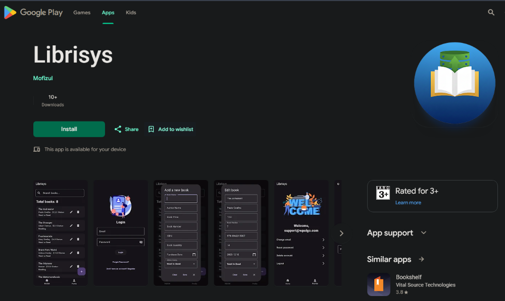
Case Study: Modernizing a University Library Experience
The Problem
A university library was still managing its catalog through a spreadsheet that was printed every morning. Students had to queue at the front desk just to find out whether a book was available.
When a book moved, staff also had to manually re-type the information.
The process was slow, repetitive, and inconvenient for both students and library staff.
What Changed
The new mobile experience allows students to check book availability directly from their phones before leaving their dorm.
Library shelf updates made from the librarian's tablet are synchronized with other devices on campus within seconds.
The result is a much smoother experience:
Students can check availability remotely.
Librarians can update information from a tablet.
Information stays synchronized across devices.
Students spend less time waiting at the front desk.
Library staff spend less time maintaining spreadsheets manually.
The project was built using Flutter and Firebase, with the focus on making the everyday library experience faster and easier.
This is an important lesson for mobile app design in 2026: great design isn't only about how an app looks. It's about how effectively it solves a real problem.
9. Design for Different Screen Sizes
People use phones with different screen sizes, resolutions, and operating systems.
A good mobile application should therefore have a flexible interface that adapts to different devices.
Layouts, images, buttons, typography, and spacing should remain usable whether someone is using a smaller phone or a larger modern smartphone.
Responsive thinking is essential even when you're designing specifically for mobile.
10. Make Navigation Feel Natural
Users should always know:
Where am I? What can I do here? Where do I go next?
Good navigation answers these questions without requiring instructions.
Bottom navigation, recognizable icons, clear labels, search functionality, and logical screen structures can help users move through an app naturally.
Avoid creating too many menus or hiding important actions behind unnecessary layers.
11. Use Dark Mode Thoughtfully
Dark mode is now a familiar feature across many mobile applications.
But simply turning a white interface black isn't enough.
A good dark-mode design considers contrast, text readability, icons, cards, shadows, images, and brand elements.
Users should be able to switch between light and dark modes without feeling like they are using two completely different applications.
12. Build Around the User Journey
Instead of designing individual screens separately, think about the entire user journey.
For example:
Open app → Search → Select → Take action → Receive confirmation
Every step should feel connected.
If one screen is beautifully designed but the next step is confusing, the overall experience still feels poor.
In 2026, successful mobile app design will increasingly focus on the complete experience rather than isolated screens.
What Makes a Mobile App Design Successful in 2026?
The biggest design trend isn't a particular color, animation, or visual style.
It's usefulness.
A successful mobile app should:
Solve a real problem
Be easy to understand
Work quickly
Feel natural on mobile
Adapt to different users
Consider accessibility
Use AI where it adds real value
Keep navigation simple
Provide useful feedback
Work reliably in real-world situations
The university library example shows how a relatively simple idea can create a significant improvement when technology is designed around people's actual needs.
Summary
Mobile app design in 2026 is moving toward experiences that are simpler, smarter, faster, and more human.
The goal isn't to add every new trend to an application. Instead, choose the design ideas that genuinely improve the user's experience.
Whether you're building a university application, business platform, e-commerce app, customer portal, or AI-powered product, start with the problem first.
Then design the technology around the people who will use it.
Because the best mobile app isn't necessarily the one with the most features—it's the one that makes the user's job easier.
Elevate Your App: Inspiring Mobile Design Examples to Explore

A great mobile app does more than work—it creates an experience that users remember.
Think about the apps you use every day. Some feel effortless from the moment you open them. The navigation makes sense, important information is easy to find, and every interaction feels natural. Others may have the same features, but a confusing interface makes them difficult to use.
That difference comes down to mobile app design.
If you're planning to build a new app or improve an existing one, exploring strong design examples can help you discover new ideas, understand modern user expectations, and create a better experience.
Here are some inspiring mobile design approaches worth exploring.
1. Clean and Minimal Mobile Interfaces
One of the strongest approaches to mobile design is keeping things simple.
A clean interface removes unnecessary elements and puts the focus on the most important actions. Clear typography, generous spacing, simple icons, and organized layouts can make even a feature-rich application feel easy to use.
For example, a productivity app might show only today's most important tasks on the home screen instead of displaying every available feature at once.
The goal is simple: help users find what they need without making them search for it.
2. Personalized Home Screens
Modern apps are becoming more personalized.
Instead of showing the same information to everyone, a mobile app can adapt its home screen based on user behavior, preferences, or previous activity.
A personalized design might include:
Frequently used features
Recommended content
Recent activity
Personalized notifications
Saved preferences
Suggested next actions
This approach makes the app feel more relevant because users see information that actually matters to them.
3. Visual-First Design
Some applications communicate better through visuals than through large amounts of text.
Travel, shopping, food delivery, fitness, and entertainment apps can use high-quality images, cards, illustrations, and visual categories to make browsing easier.
A strong visual hierarchy helps users understand what is important before they even read the details.
However, visuals should support the experience—not slow the application down or make navigation confusing.
4. Smooth Microinteractions
Small interactions can make a mobile app feel much more polished.
Imagine tapping a button and seeing a subtle animation that confirms your action. Or completing a task and seeing a small visual celebration.
These are examples of microinteractions.
Useful microinteractions can communicate:
Something was successfully completed
A button was selected
Data is loading
A change has been saved
An error needs attention
When used carefully, these details make the interface feel responsive and alive.
5. Bottom Navigation for Easy Access
Mobile users often hold their phones with one hand, so important navigation should be easy to reach.
Bottom navigation is a popular design pattern because it places the most important sections within easy thumb reach.
For example:
Home → Search → Activity → Favorites → Profile
The exact structure depends on the application, but the principle remains the same: keep the most important destinations easy to access.
6. Dark Mode That Feels Native
Dark mode has become an expected feature for many users.
A well-designed dark interface doesn't simply replace white with black. It considers contrast, text readability, cards, icons, images, borders, and brand elements.
The best dark-mode experiences feel intentionally designed rather than like an afterthought.
Giving users the option to switch between light and dark themes can also make the application more comfortable in different environments.
7. AI-Powered Mobile Experiences
AI is creating new opportunities for mobile app design.
Instead of making users navigate through multiple screens, AI can help them accomplish tasks through natural language.
For example, a business application could allow a user to ask:
"Show me this month's highest-performing customers."
Instead of manually searching through reports, the app could understand the request and present the relevant information.
AI can also support:
Smart search
Recommendations
Personalized experiences
Automated support
Content generation
Voice interactions
Intelligent summaries
The important thing is not simply adding AI. The AI should make the experience easier and more useful.
8. Mobile Shopping Experiences
E-commerce apps provide excellent examples of how design can simplify complex journeys.
A strong shopping experience might include:
Discover → Explore → Compare → Add to Cart → Checkout → Track Order
Each step should be clear.
Product images, prices, reviews, filters, search, and checkout options should be presented without overwhelming the user.
Even small improvements—such as reducing unnecessary checkout fields—can make the experience significantly better.
9. Mobile App Design That Solves a Real Problem
Sometimes the most inspiring design isn't the most visually impressive one.
It's the design that solves a frustrating real-world problem.
Case Study: Modernizing a University Library
A university library was managing its catalog using a spreadsheet that was printed every morning.
Students had to visit the front desk and wait just to find out whether a book was available. Library staff also had to manually update the list whenever a book moved.
The solution was a mobile-focused library experience.
Students could check book availability from their phones before leaving their dorm. Librarians could update shelf information from a tablet, and those updates could synchronize across campus devices within seconds.
The result was a much smoother experience:
Students could check availability remotely.
Staff could update information more efficiently.
Information stayed synchronized.
Front-desk queues were reduced.
Manual spreadsheet work was minimized.
The project used Flutter and Firebase.
This example shows an important principle of mobile design: great design starts with understanding the user's problem.
10. Accessibility-First Design
A beautiful application should also be usable by as many people as possible.
Accessibility-focused mobile design can include:
Readable typography
Sufficient color contrast
Large touch targets
Clear labels
Screen-reader support
Simple navigation
Alternatives to color-only indicators
Accessibility isn't just a technical requirement. It can make the overall experience easier for everyone.
11. Personalized Notifications
Notifications can be useful—or annoying.
The difference is relevance.
Instead of sending users constant promotional messages, a well-designed app can send timely notifications based on meaningful actions.
For example:
"Your order has arrived."
is much more useful than repeatedly sending generic promotional notifications.
Good notification design gives users useful information while allowing them to control what they receive.
12. Design for Speed
Great visuals won't matter if the app feels slow.
Mobile design should consider performance from the beginning.
Optimized images, lightweight animations, efficient data loading, and clear loading states can make the application feel significantly faster.
Users don't want to wait for an interface to catch up with them.
They want to tap, swipe, search, and move forward.
How to Use These Examples for Your Own App
Don't copy another application's design screen by screen.
Instead, study why the design works.
Ask yourself:
Is the navigation easy to understand?
What does the app show first?
How many steps are required to complete an important action?
Which elements receive the most visual attention?
How does the app provide feedback?
What makes the experience feel fast?
How does it solve a user's real problem?
Where could the experience be simpler?
These questions can help you turn design inspiration into practical ideas.
Final Thoughts
The best mobile app designs aren't necessarily the ones with the most animations, colors, or features.
They are the ones that make users think less and accomplish more.
Whether you're designing a business application, e-commerce platform, education app, library system, or AI-powered product, focus on the complete user experience.
Start with the problem. Understand the user. Then design the technology around them.
That's how you can elevate an app from simply functional to genuinely useful.
